Rytmisk Center
Identity, SoMe
,
2024 →
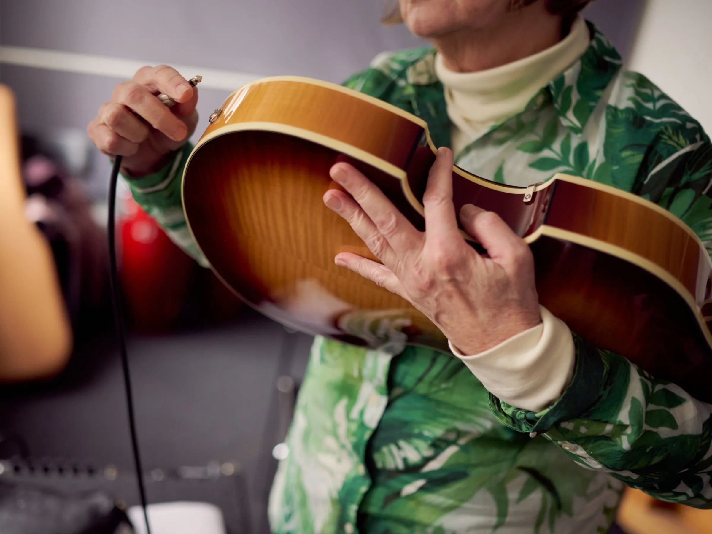
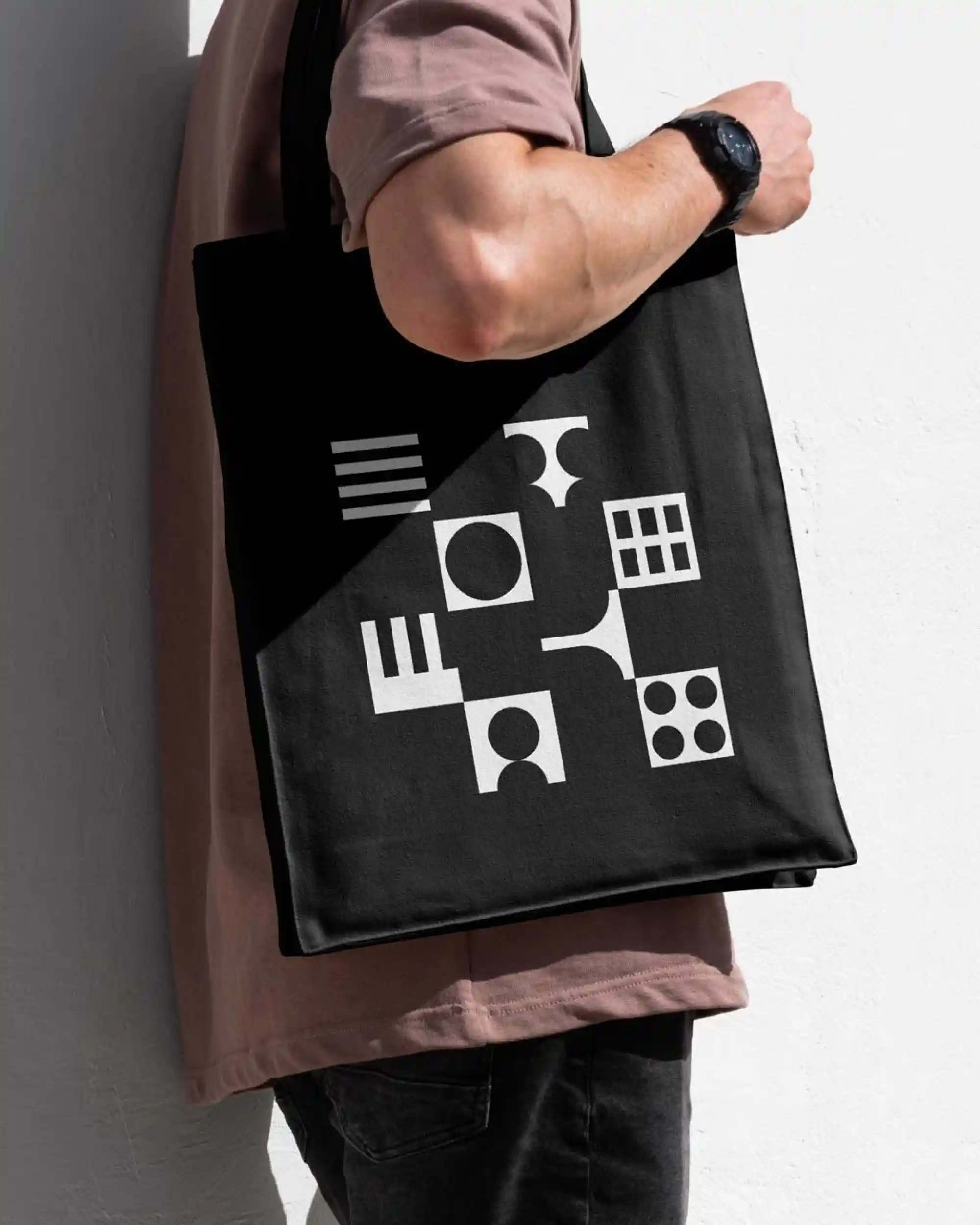
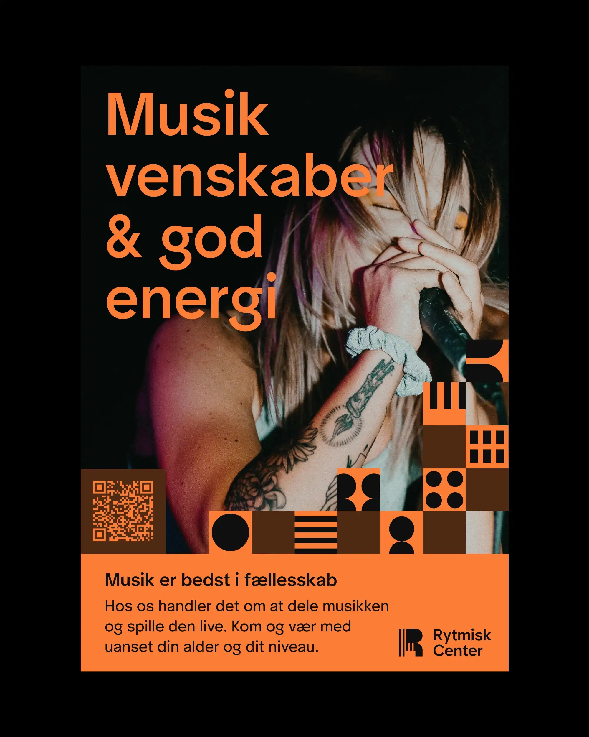
One identity. Every audience. Endless variation. Rytmisk Center is publicly funded. 5,000 participants, several locations, toddler classes to professional training in music, dance, and theater. Every age, every genre. The music is the constant. The mark holds strings and keys. The same shapes make the icons. Instruments, a person, people. The icons say what. The colour says who. Every combination is a different audience. They go across every medium. On a stock photo, the icons make it theirs instantly. Strict templates, plus a custom tool we built them. The office makes a poster, a post, a site update, without us. What templates cannot do is people. We produce the video. Real instructors, real students, real rooms. Course enrollments up more than 30% since launch. Partnership ongoing since 2024.
IDENTITY.mp4
PHOTOSHOOT.jpg
REELS.mp4

ICONS.jpg
MERCH.jpg
REELS.mp4
POSTER.jpg
CAROUSEL.jpgs
REEL.mp4
CUBE.mp4
Rytmisk Center
Identity, SoMe
,
2024 →
One identity. Every audience. Endless variation. Rytmisk Center is publicly funded. 5,000 participants, several locations, toddler classes to professional training in music, dance, and theater. Every age, every genre. The music is the constant. The mark holds strings and keys. The same shapes make the icons. Instruments, a person, people. The icons say what. The colour says who. Every combination is a different audience. They go across every medium. On a stock photo, the icons make it theirs instantly. Strict templates, plus a custom tool we built them. The office makes a poster, a post, a site update, without us. What templates cannot do is people. We produce the video. Real instructors, real students, real rooms. Course enrollments up more than 30% since launch. Partnership ongoing since 2024.
IDENTITY.mp4
PHOTOSHOOT.jpg
REELS.mp4
ICONS.jpg
MERCH.jpg
REELS.mp4
POSTER.jpg
CAROUSEL.jpgs
REEL.mp4
CUBE.mp4
AUTOR
Identity, Website
,
2020
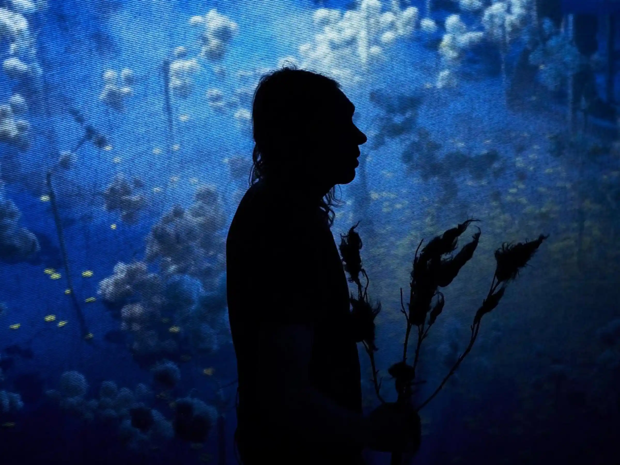
AUTOR is Denmark's largest association for composers, songwriters, lyricists, and producers. From electronic music to folk, film scores to metal. The old brand no longer did them justice. They needed a professional foundation that would last. The challenge was making a single identity that reflected the diversity of their membership while feeling current and built to last. We created a full identity system, guidelines, and a headless WordPress website built for easy internal use. The logo references the simplicity of a record cover. The visual system draws from music history. Clear, recognizable, built to last.
SHOWCASE.JPG
VIBE.jpg
ANIMATION.mp4
Carousel.JPG
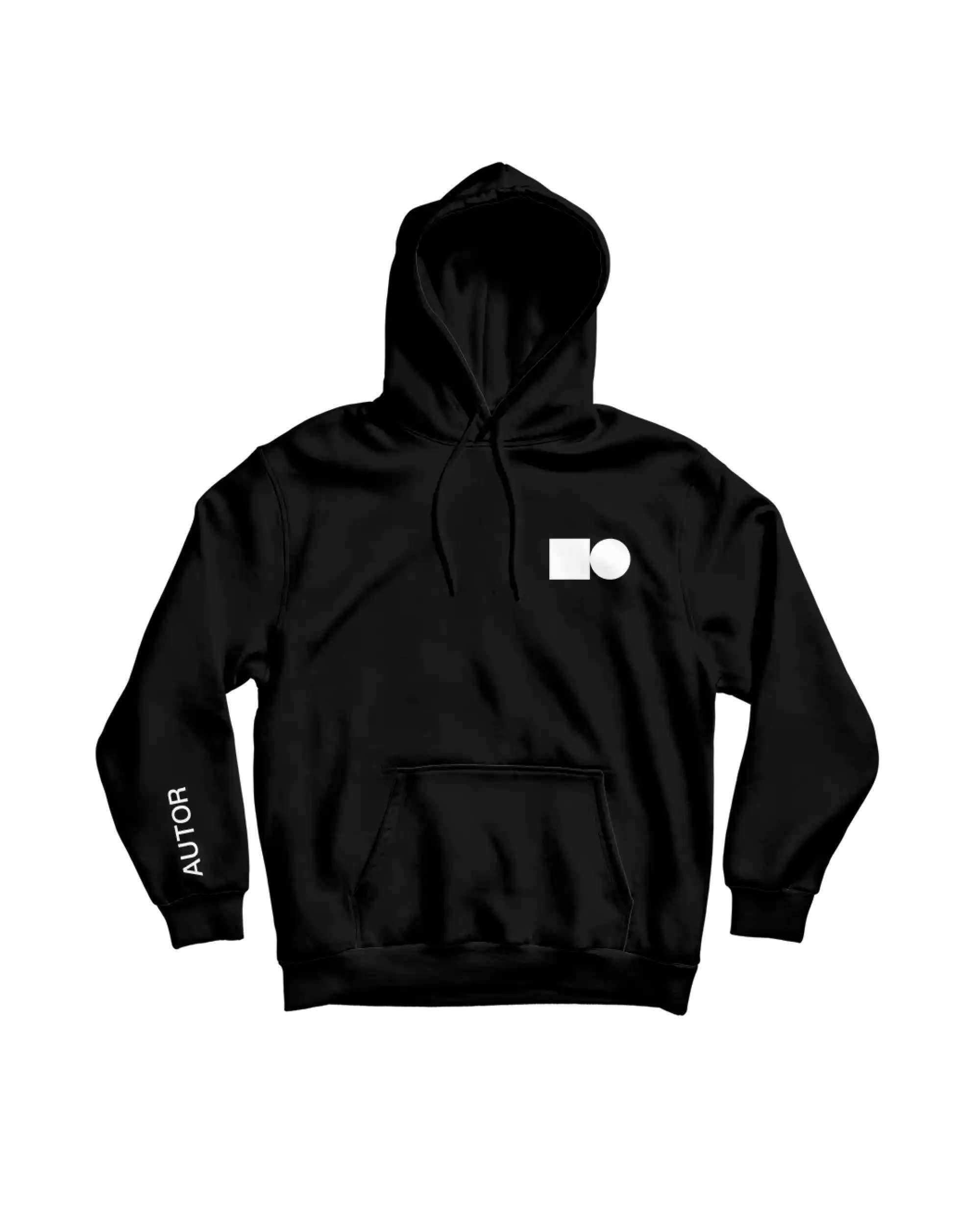
MERCH.png
WEB_DESKTOP.MP4
WEB_PHONE.JPG
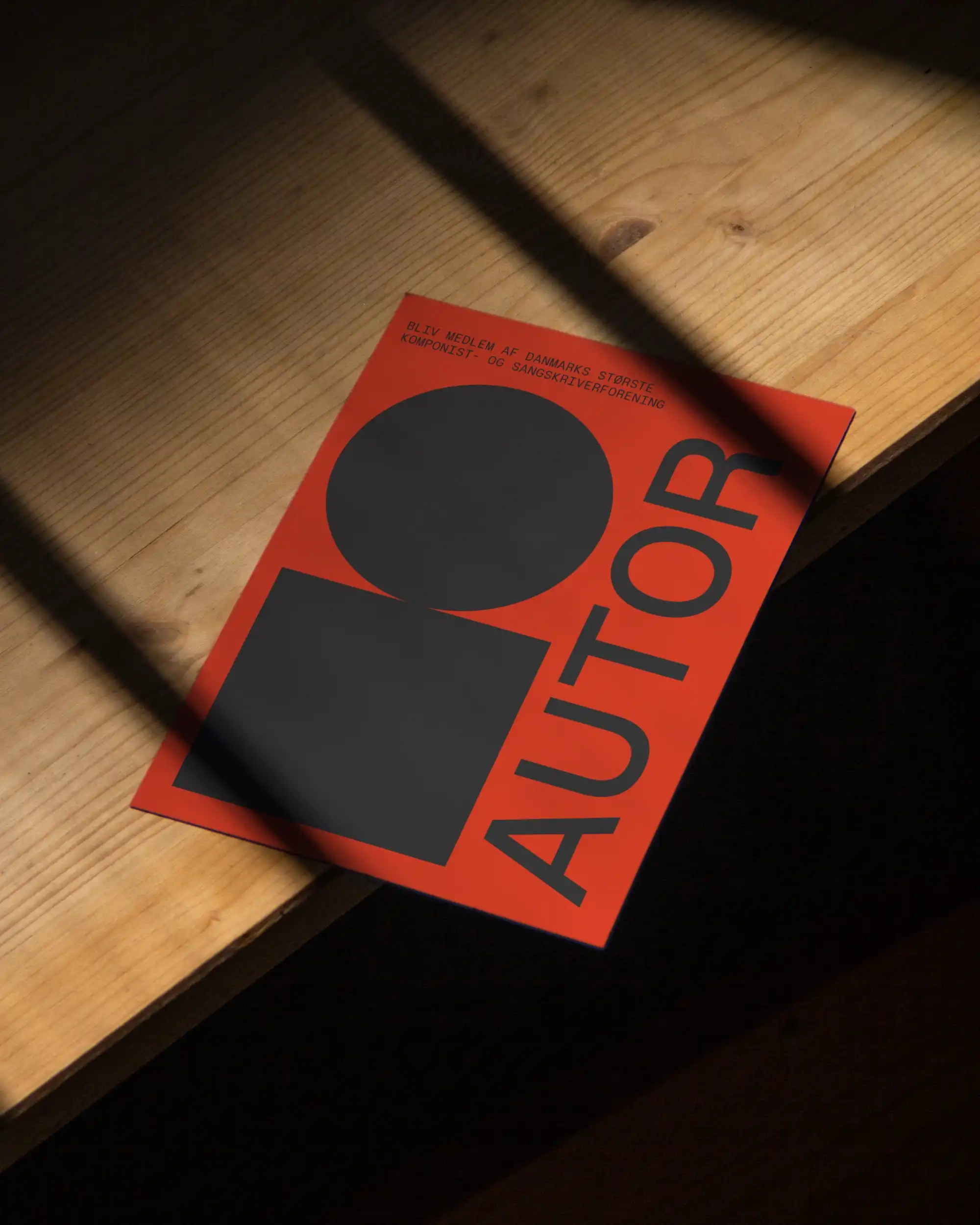
FLYER.indd
AUTOR
Identity, Website
,
2020
AUTOR is Denmark's largest association for composers, songwriters, lyricists, and producers. From electronic music to folk, film scores to metal. The old brand no longer did them justice. They needed a professional foundation that would last. The challenge was making a single identity that reflected the diversity of their membership while feeling current and built to last. We created a full identity system, guidelines, and a headless WordPress website built for easy internal use. The logo references the simplicity of a record cover. The visual system draws from music history. Clear, recognizable, built to last.
SHOWCASE.JPG
VIBE.jpg
ANIMATION.mp4
Carousel.JPG
MERCH.png
WEB_DESKTOP.MP4
WEB_PHONE.JPG
FLYER.indd
Generator
Identity, Website, Social
,
2019 →
Generator is the studystart festival of Odense. Two days every September. The logo already existed. What did not exist was the discipline around it. One yellow. One typeface. No exceptions. Two rules, and everything else adapts around them. The shape inside the mark has changed across the years. The yellow and the type have not. That frees us to spend each year keeping the branding fresh. New templates before every edition, plus the campaign and motion work around them. The festival works from those templates. It lets them move fast and stay present without anything drifting off brand. We produce live at the festival, posting while the crowd is still in front of the stage. The same footage becomes the campaign for the next edition. The work compounds. Seven editions on the same foundation. The colour is recognised before the name. Partnership ongoing since 2019.
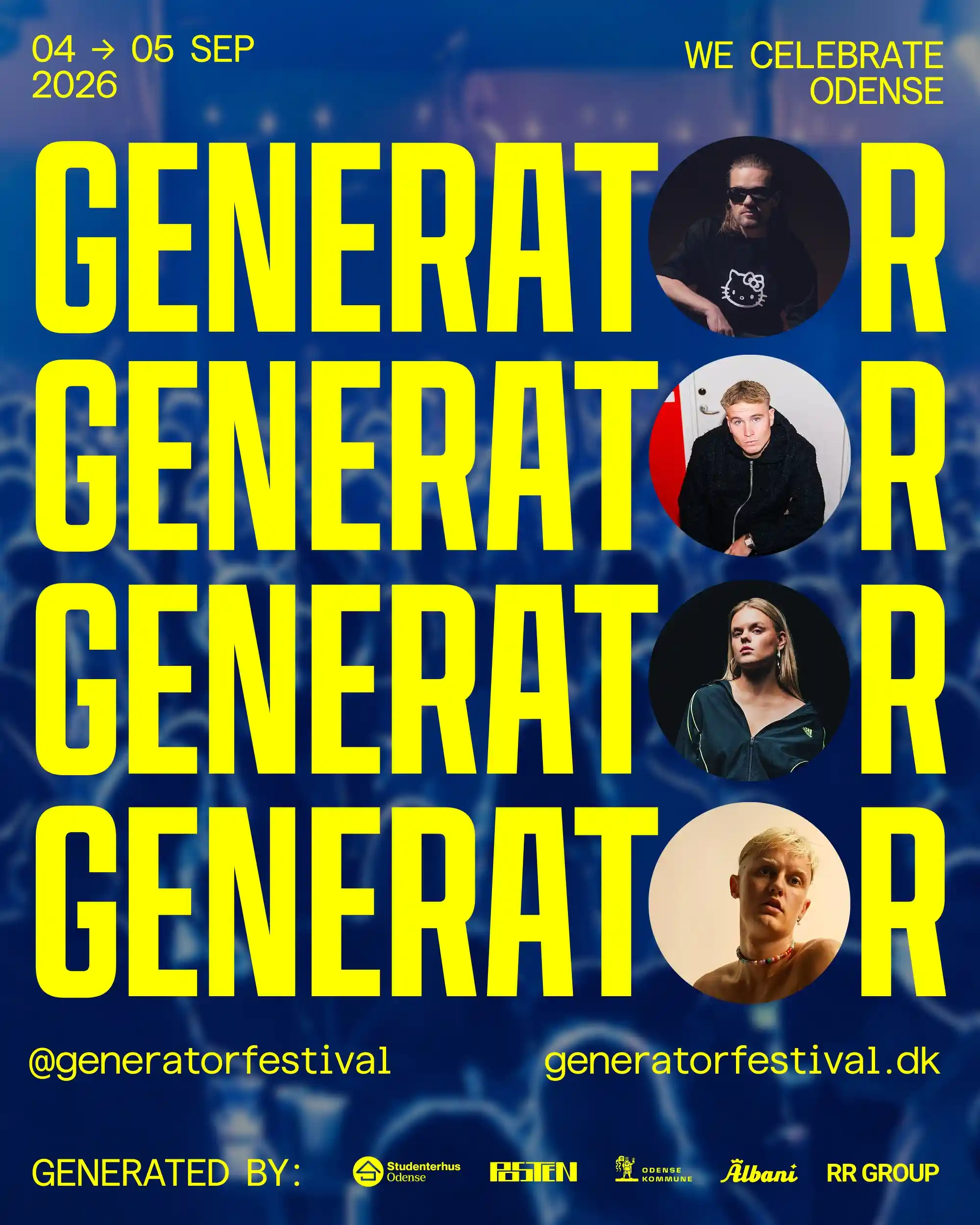
LOGO.JPG
REEL26.jpg

STAGE24.JPG
REEL25.MP4
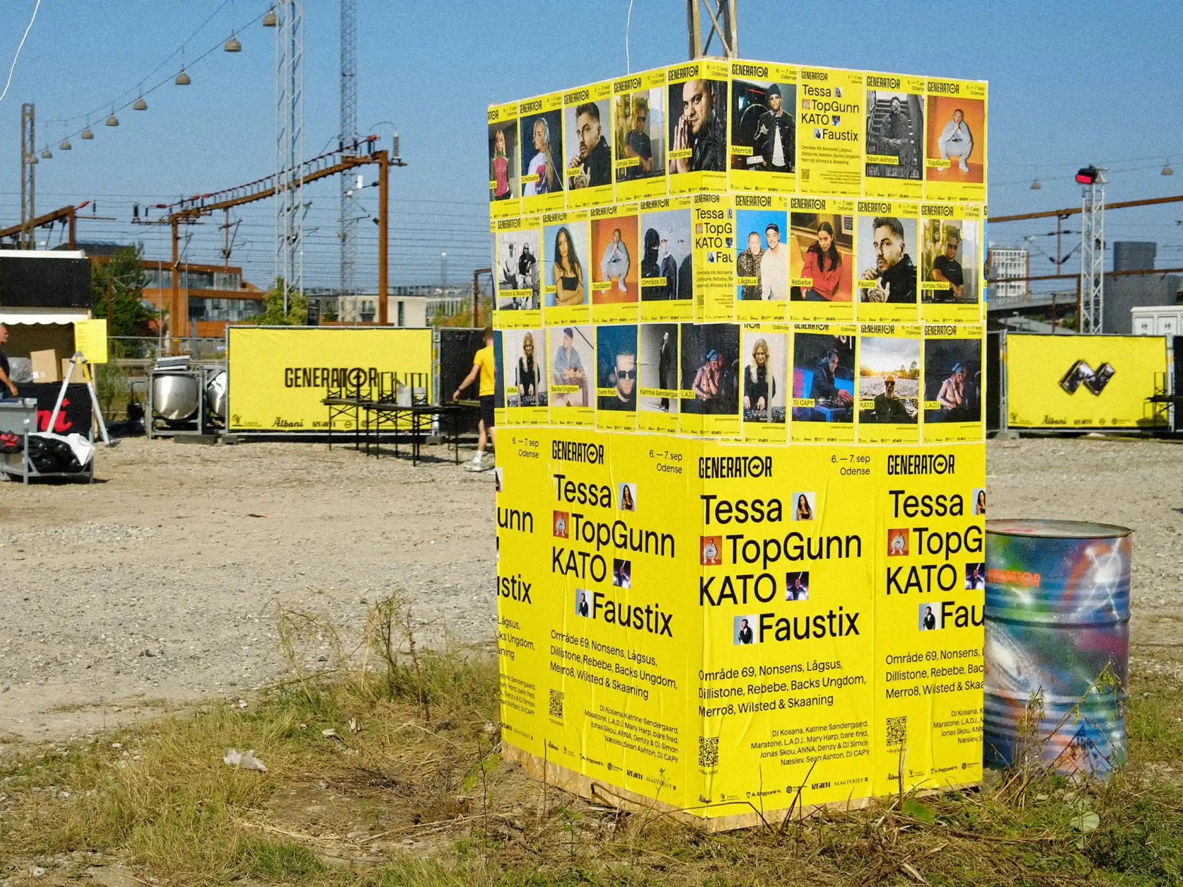
POSTERS25.JPG
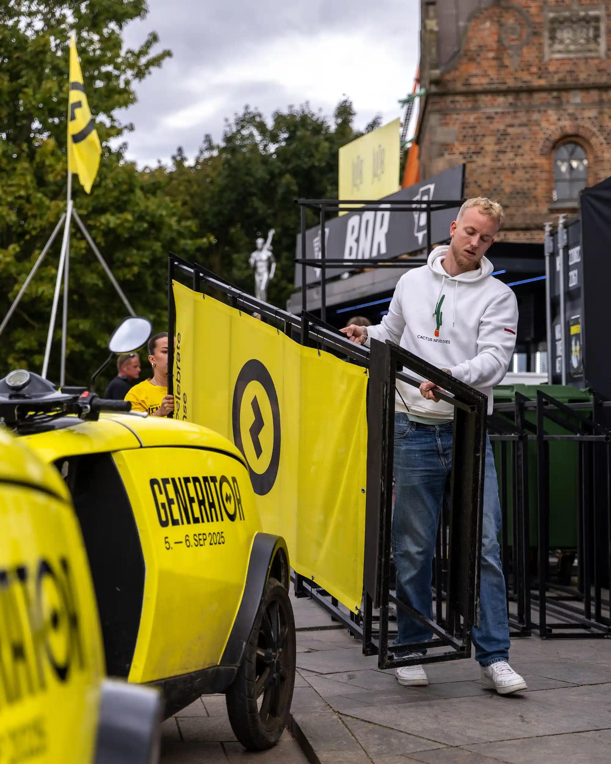
VENUE.JPG
REEL.MP4
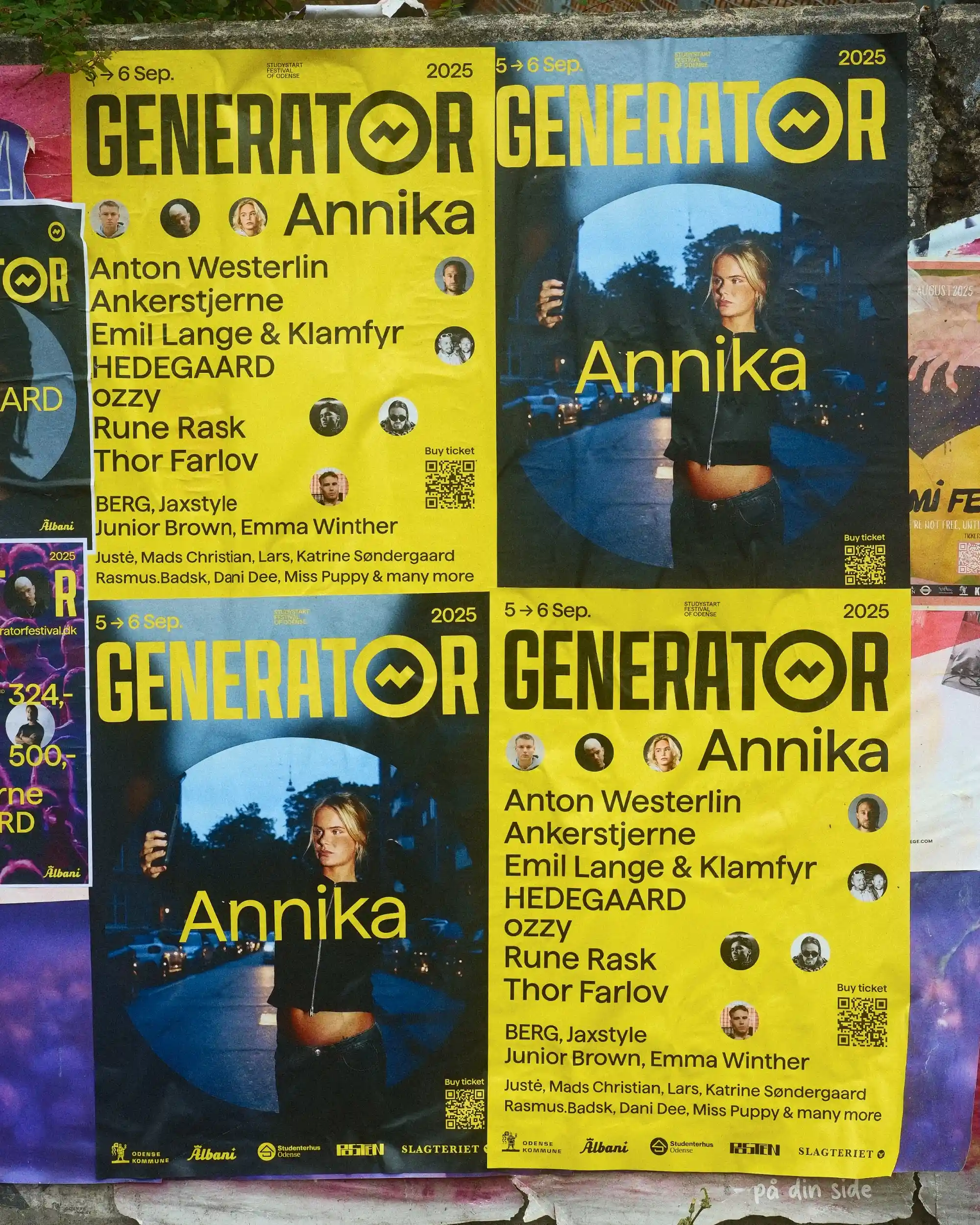
ARTIST_POSTER25.JPG
Generator
Identity, Website, Social
,
2019 →
Generator is the studystart festival of Odense. Two days every September. The logo already existed. What did not exist was the discipline around it. One yellow. One typeface. No exceptions. Two rules, and everything else adapts around them. The shape inside the mark has changed across the years. The yellow and the type have not. That frees us to spend each year keeping the branding fresh. New templates before every edition, plus the campaign and motion work around them. The festival works from those templates. It lets them move fast and stay present without anything drifting off brand. We produce live at the festival, posting while the crowd is still in front of the stage. The same footage becomes the campaign for the next edition. The work compounds. Seven editions on the same foundation. The colour is recognised before the name. Partnership ongoing since 2019.
LOGO.JPG
REEL26.jpg
STAGE24.JPG
REEL25.MP4
POSTERS25.JPG
VENUE.JPG
REEL.MP4
ARTIST_POSTER25.JPG
RESONATOR
Identity, Website
,
2021 - 2023
Resonator is an international roots and world music festival based in Odense. Artists from 15 to 18 countries. The brief was one identity that could contain music from across continents and traditions. Unified but not uniform. Consistent but never repetitive. The visual system borrows from the record store. Flipping through vinyl to discover something new. The palette pulls from flags across the globe. Green, blue, yellow, red for the range of world music. Clay to symbolize the specific tie to roots music. The colors unify. The layout never repeats. The logo a clear reference to flags. The team now maintains the identity internally. A timeless systems, that adapts with the festival.
LOGO.JPG
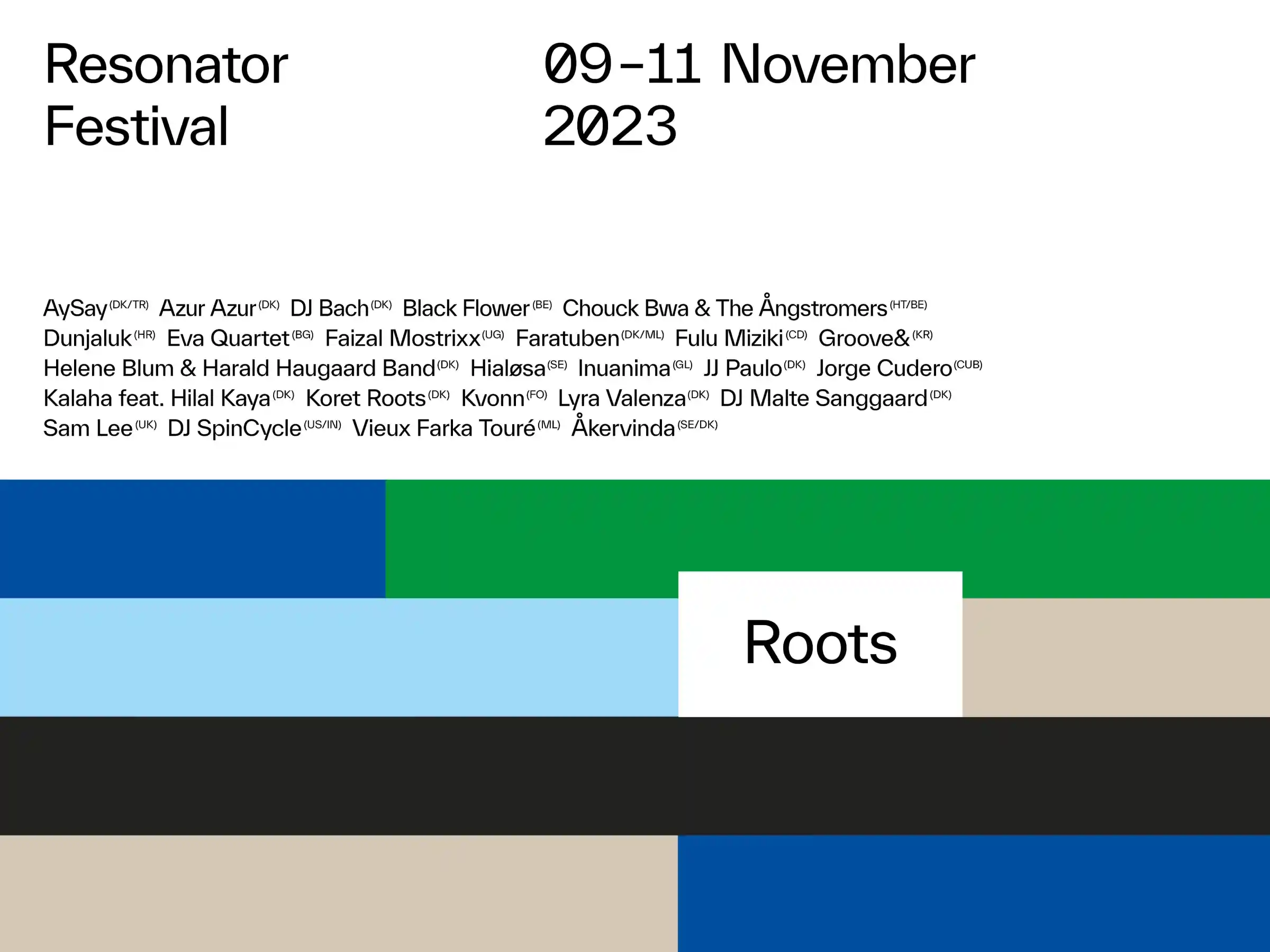
POSTER23.jpg
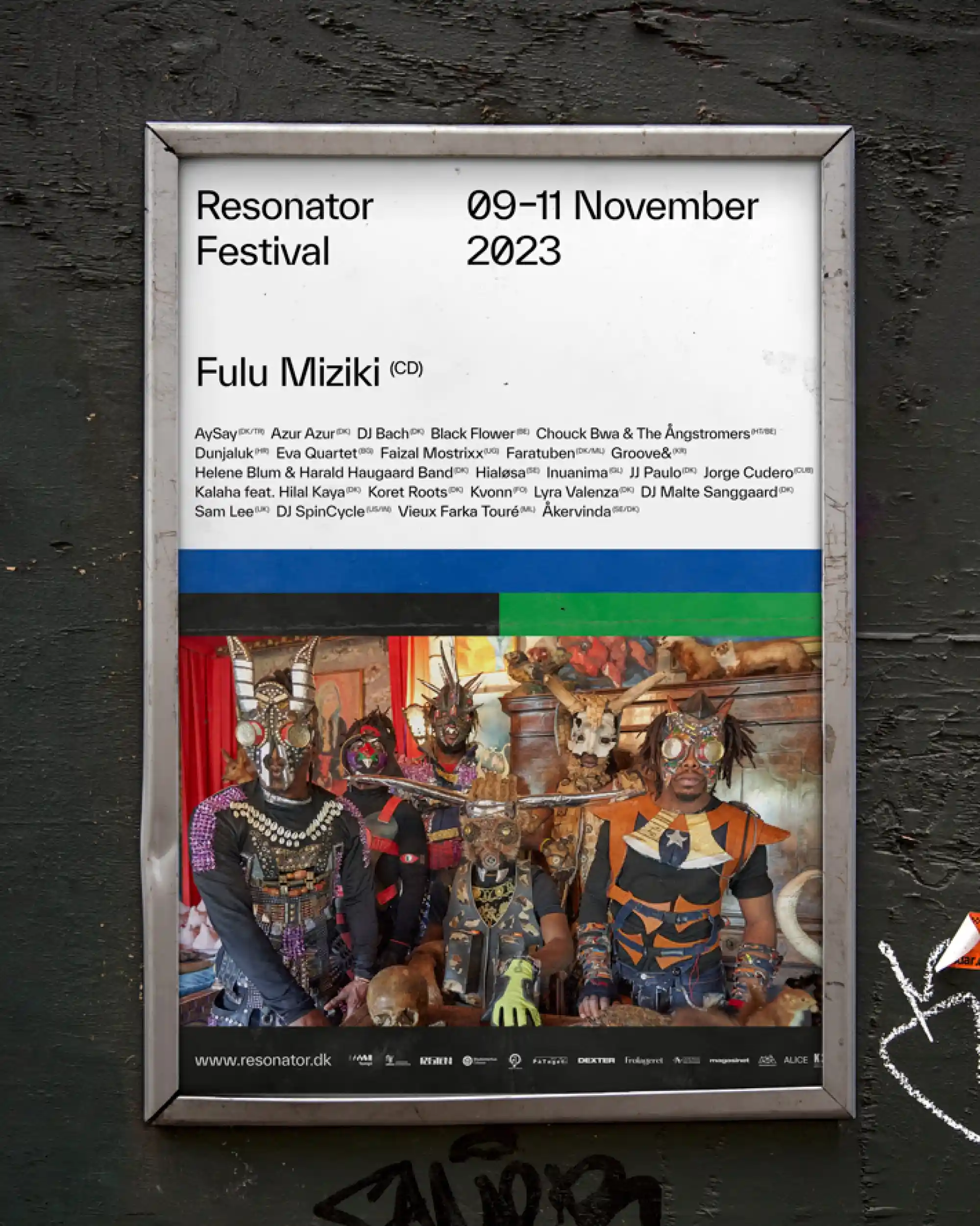
ARTIST_POSTER23.JPG
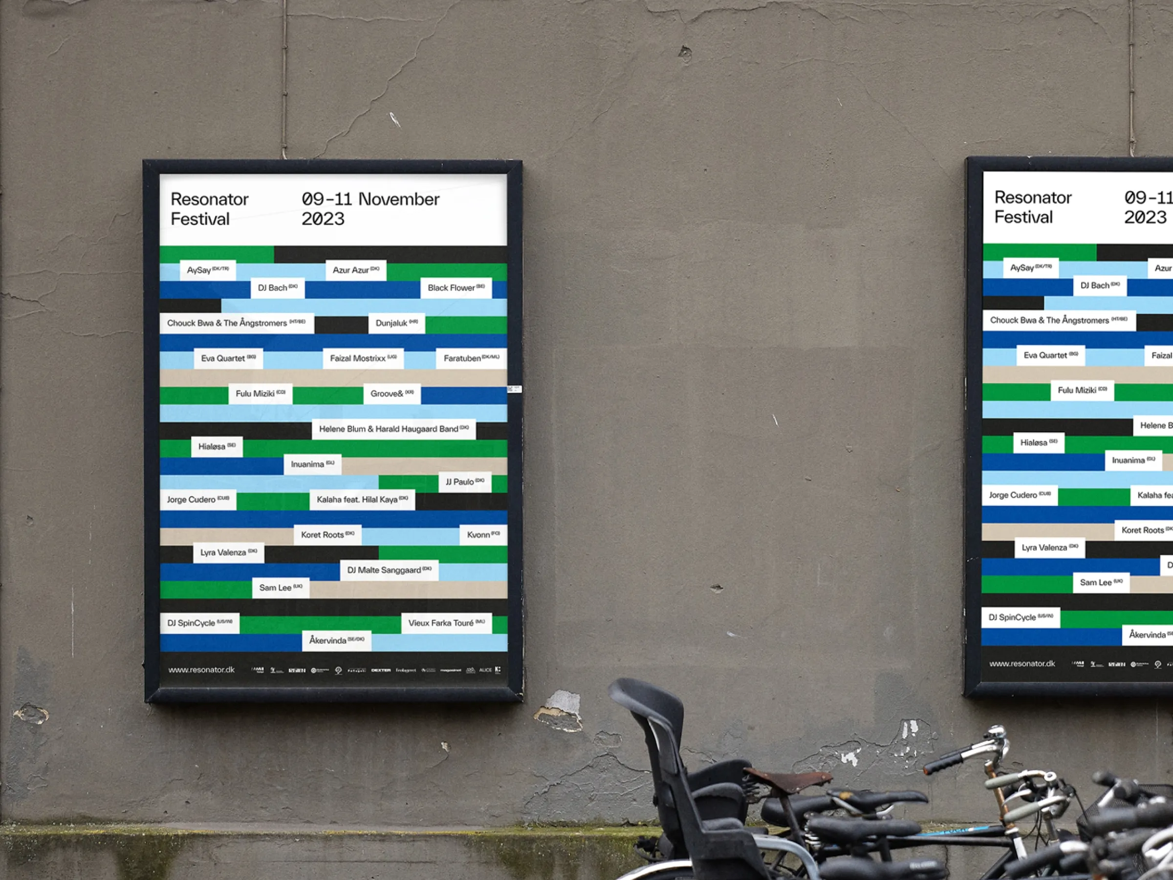
LINEUP_POSTER23.jpg
MOOD.MP4
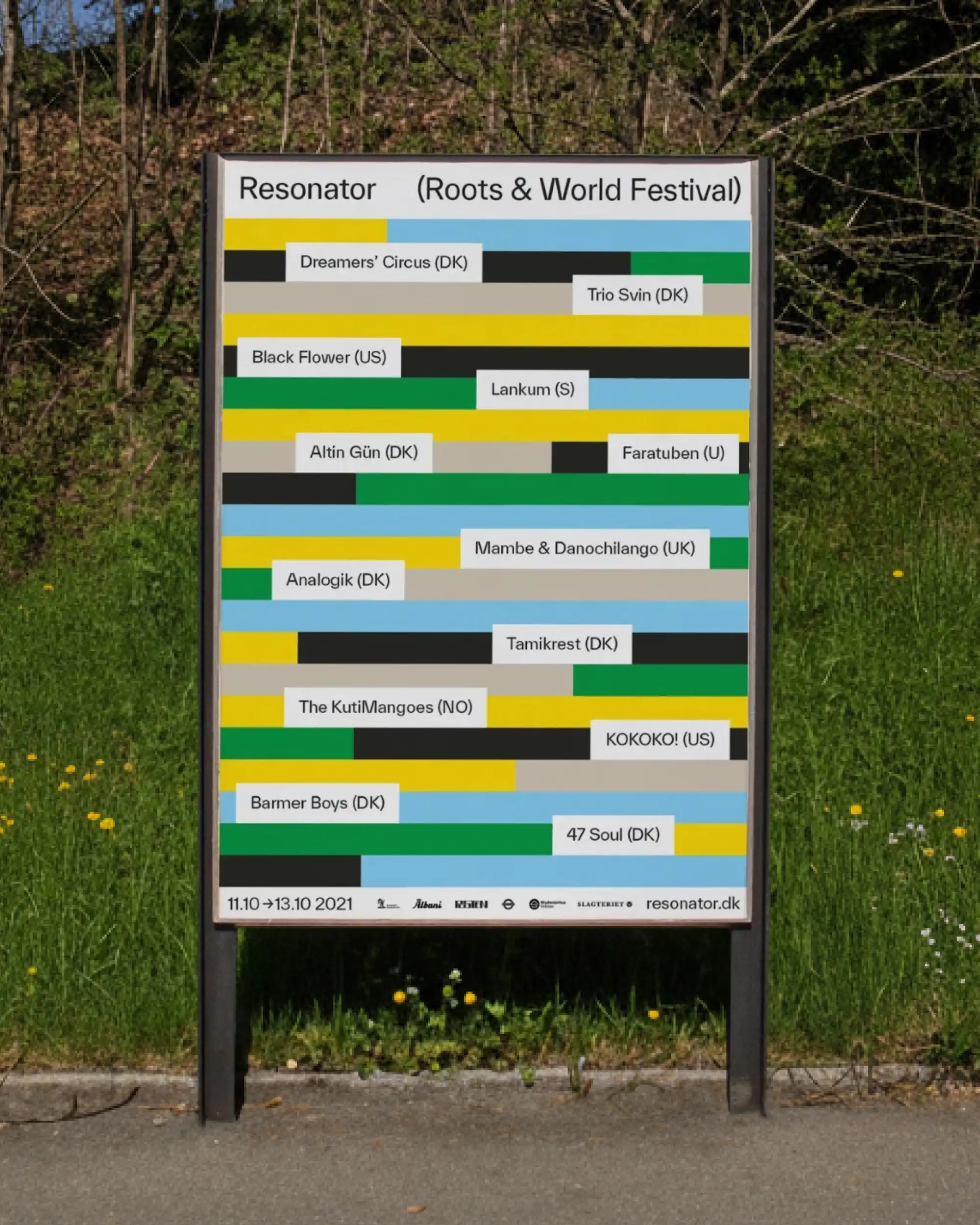
LINEUP_POSTER21.JPG
CAROUSEL.jpgs
MOOD.MP4
RESONATOR
Identity, Website
,
2021 - 2023
Resonator is an international roots and world music festival based in Odense. Artists from 15 to 18 countries. The brief was one identity that could contain music from across continents and traditions. Unified but not uniform. Consistent but never repetitive. The visual system borrows from the record store. Flipping through vinyl to discover something new. The palette pulls from flags across the globe. Green, blue, yellow, red for the range of world music. Clay to symbolize the specific tie to roots music. The colors unify. The layout never repeats. The logo a clear reference to flags. The team now maintains the identity internally. A timeless systems, that adapts with the festival.
LOGO.JPG
POSTER23.jpg
ARTIST_POSTER23.JPG
LINEUP_POSTER23.jpg
MOOD.MP4
LINEUP_POSTER21.JPG
CAROUSEL.jpgs
MOOD.MP4
Ecocare
Identity, Brand Strategy, Website
,
2020 →
Mosh and Edris started a pest control company in London in 2020. Ambitious founders who knew how to deliver extraordinary service and had clear growth goals. They needed a brand that could support that ambition. We started with brand strategy. The insight was simple: when someone has a pest problem, they're already panicking. The industry standard is to amplify that fear. We went the opposite direction. The tone of voice strategy became "show empathy for the current sense of panic without adding to it." No fear messaging. Clear, confident, proactive communication. Specialists who understand urban pest challenges intimately, but without technical jargon that creates distance. That strategic decision shaped everything. While competitors wrote "EMERGENCY RAT REMOVAL," we wrote "Expert eviction services for your uninvited basement residents." London cultural references, neighbourhood-specific copy, precise but casual language. The kind of voice that builds trust with both residential clients and commercial operations. The visual system reinforced the strategy. Custom 3D illustration library instead of stock photography. Green palette instead of warning colors. Clean, intuitive design paired with confident messaging. Framer-built website with modular templates for services, locations, and industry verticals. SEO architecture designed for national expansion. Everything built so adding Birmingham or Manchester took hours, not weeks. We worked closely with Mosh and Edris through the entire build and kept working together as they scaled. The brand system did its job. Within five years, they went from local London operation to nationwide coverage, growing to a 12-person team serving 5,000+ customers across the UK. Sales increased significantly as the company expanded. Ongoing partnership since 2020.
Logo.JPG
LANDINGPAGE.mp4
LUCA_03.JPG
ICONS.mp4
OFFERING.JPG
ICONS.mp4
Ecocare
Identity, Brand Strategy, Website
,
2020 →
Mosh and Edris started a pest control company in London in 2020. Ambitious founders who knew how to deliver extraordinary service and had clear growth goals. They needed a brand that could support that ambition. We started with brand strategy. The insight was simple: when someone has a pest problem, they're already panicking. The industry standard is to amplify that fear. We went the opposite direction. The tone of voice strategy became "show empathy for the current sense of panic without adding to it." No fear messaging. Clear, confident, proactive communication. Specialists who understand urban pest challenges intimately, but without technical jargon that creates distance. That strategic decision shaped everything. While competitors wrote "EMERGENCY RAT REMOVAL," we wrote "Expert eviction services for your uninvited basement residents." London cultural references, neighbourhood-specific copy, precise but casual language. The kind of voice that builds trust with both residential clients and commercial operations. The visual system reinforced the strategy. Custom 3D illustration library instead of stock photography. Green palette instead of warning colors. Clean, intuitive design paired with confident messaging. Framer-built website with modular templates for services, locations, and industry verticals. SEO architecture designed for national expansion. Everything built so adding Birmingham or Manchester took hours, not weeks. We worked closely with Mosh and Edris through the entire build and kept working together as they scaled. The brand system did its job. Within five years, they went from local London operation to nationwide coverage, growing to a 12-person team serving 5,000+ customers across the UK. Sales increased significantly as the company expanded. Ongoing partnership since 2020.
Logo.JPG
LANDINGPAGE.mp4
LUCA_03.JPG
ICONS.mp4
OFFERING.JPG
ICONS.mp4
Frue Plads Marked
Identity, SoMe, Print
,
2025
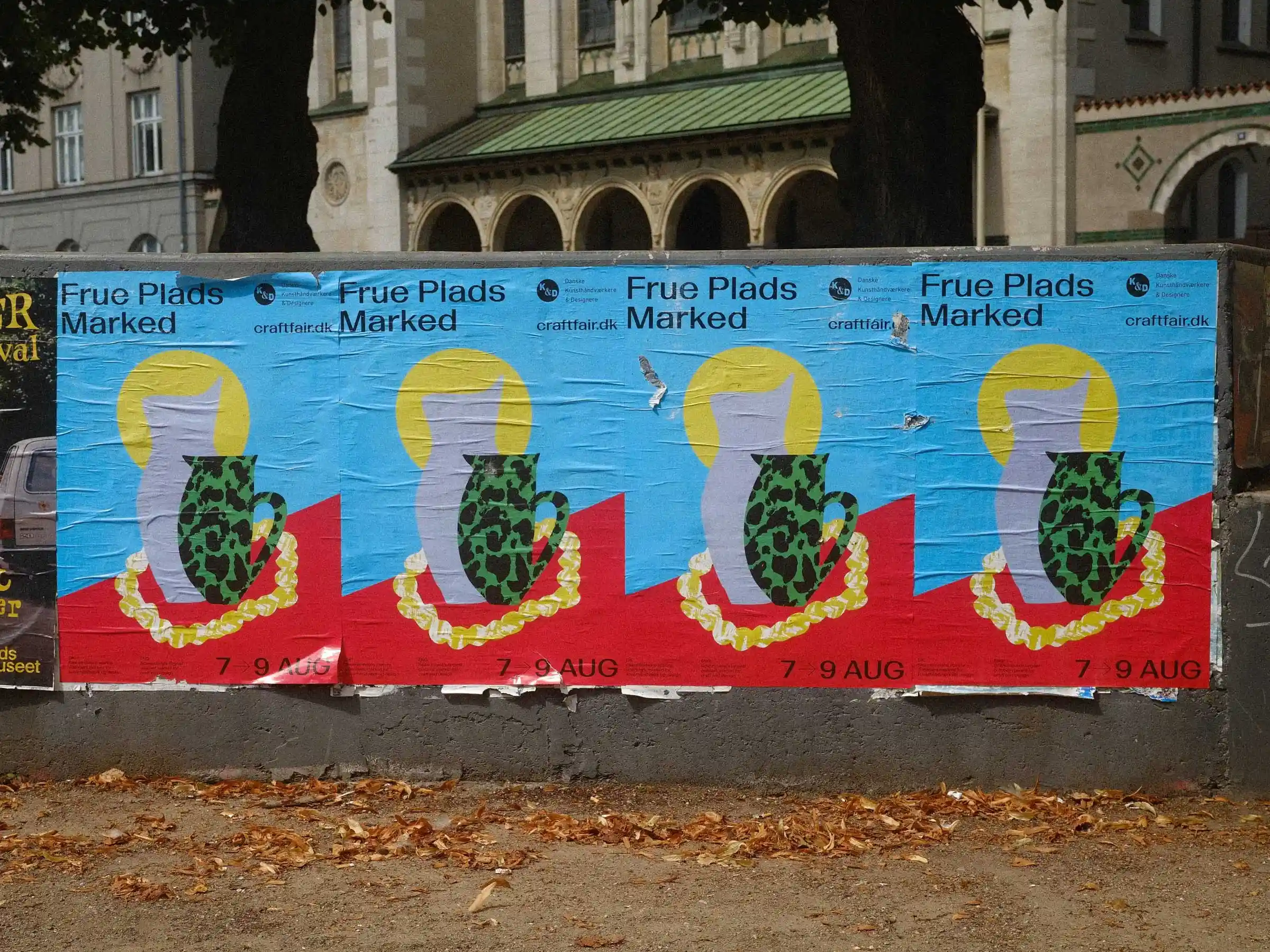
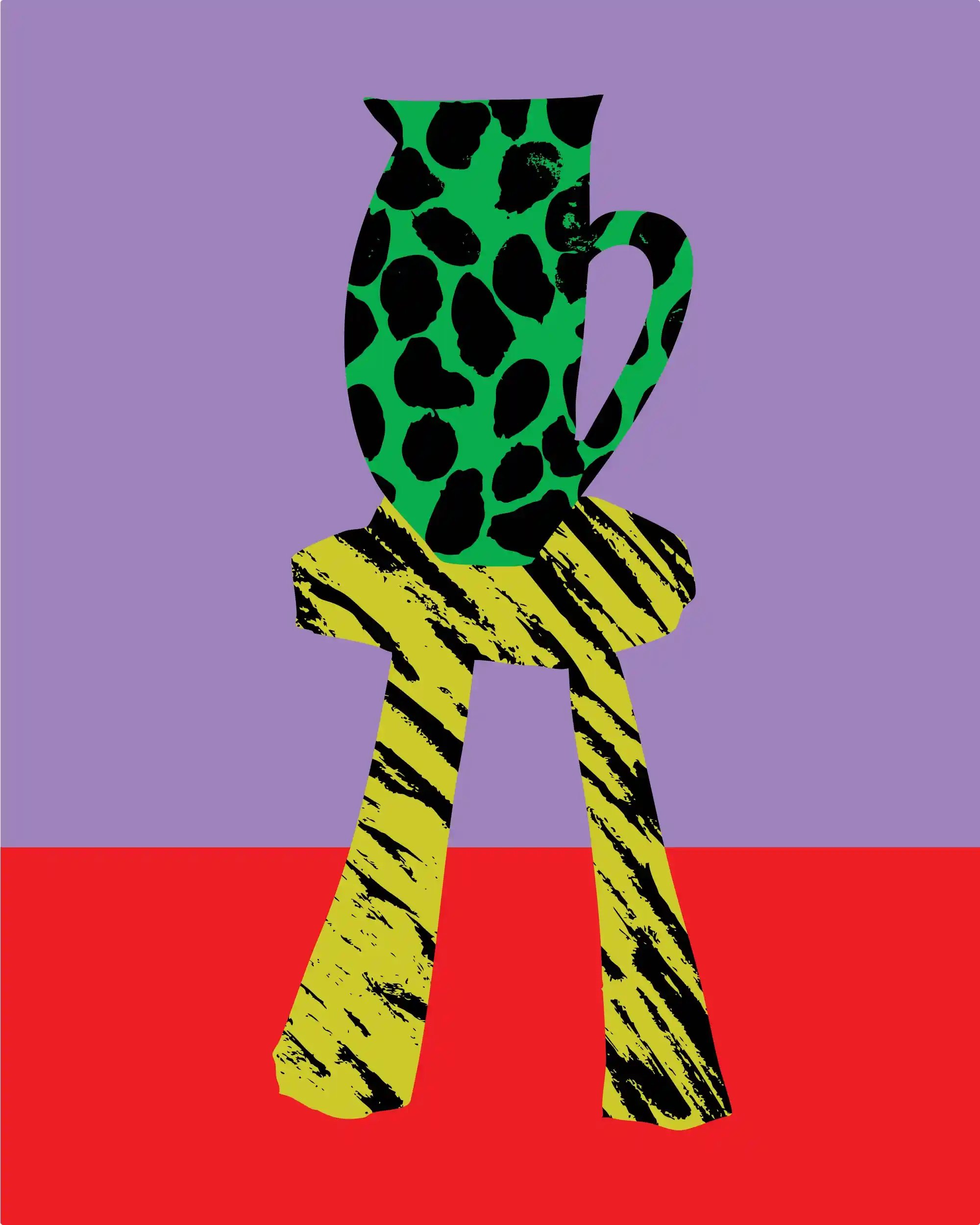
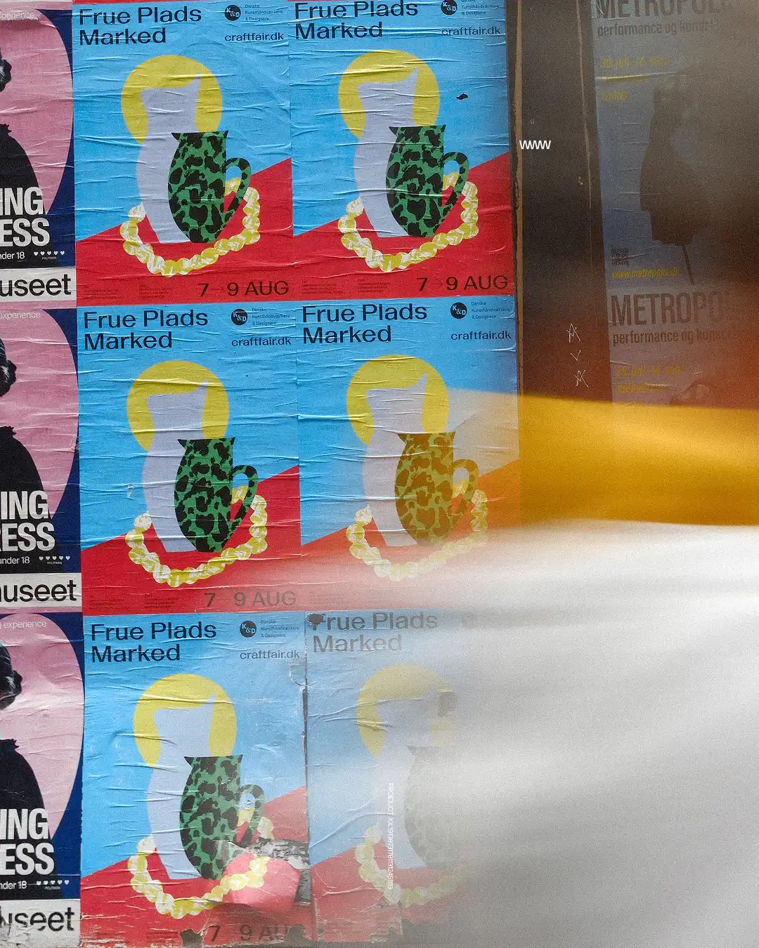
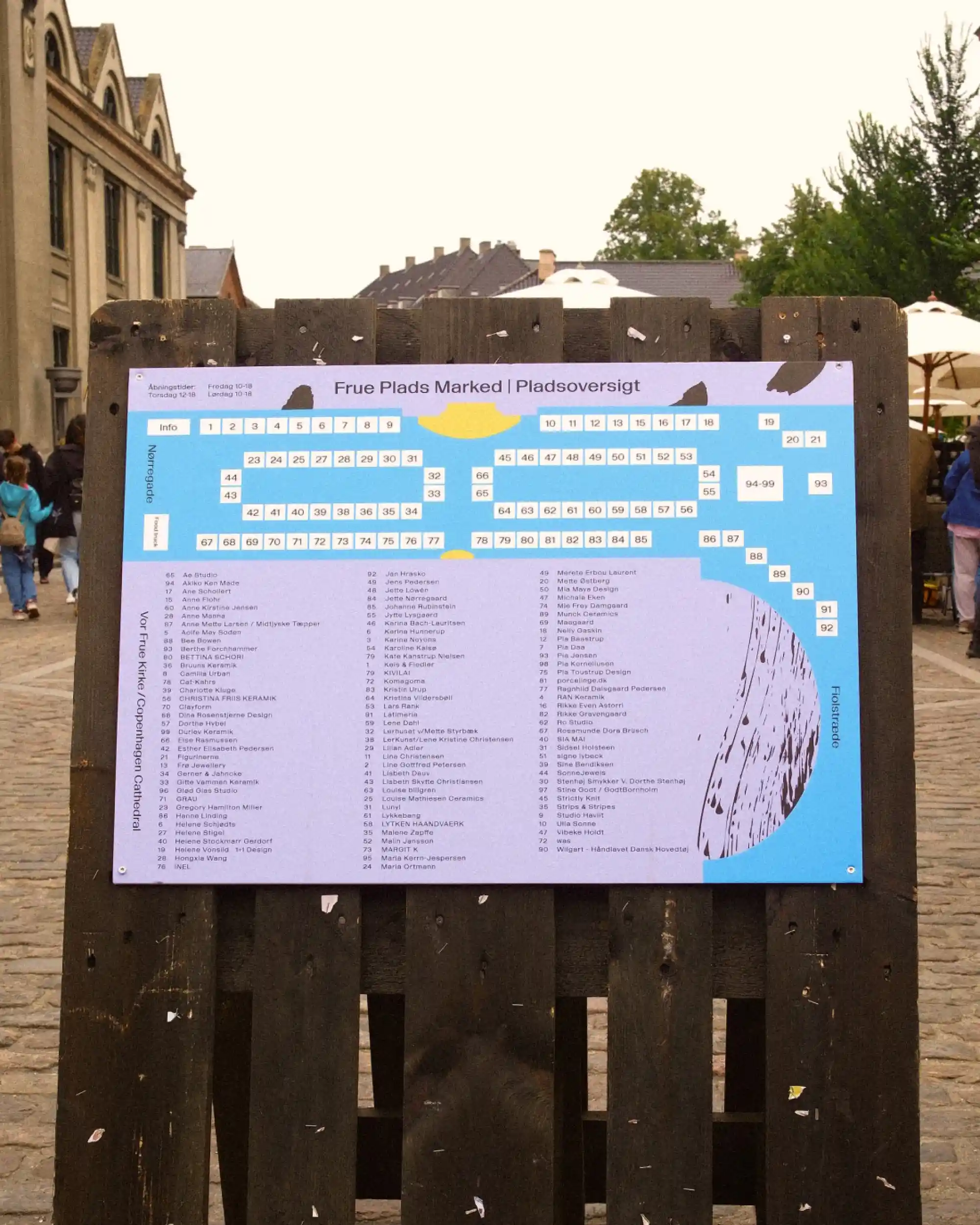
Frue Plads Marked exists because there's a difference between things made by machines and things made by people. One hundred artisans, one hundred approaches. The identity needed to contain that range without flattening it. The visual system is built of shapes, patterns and brushstrokes. Hand-drawn, imperfect, never repeated. The same logic as the market itself.
BRUSHSTROKES.mp4
POSTERS.indd
ARTWORK.jpg
MAP.indd
EXPOSURE.mp4
Frue Plads Marked
Identity, SoMe, Print
,
2025
Frue Plads Marked exists because there's a difference between things made by machines and things made by people. One hundred artisans, one hundred approaches. The identity needed to contain that range without flattening it. The visual system is built of shapes, patterns and brushstrokes. Hand-drawn, imperfect, never repeated. The same logic as the market itself.
BRUSHSTROKES.mp4
POSTERS.indd
ARTWORK.jpg
MAP.indd
EXPOSURE.mp4
FOLKESKOLEN
Identity, Production
,
2020 - 2023
We redesigned Fagbladet Folkeskolen's visual identity in 2020 and ran the editorial layout for four years. The real test of any identity system is whether it holds at scale across 2,000 pages, rotating photographers, and illustrators brought in from across the world. It did.
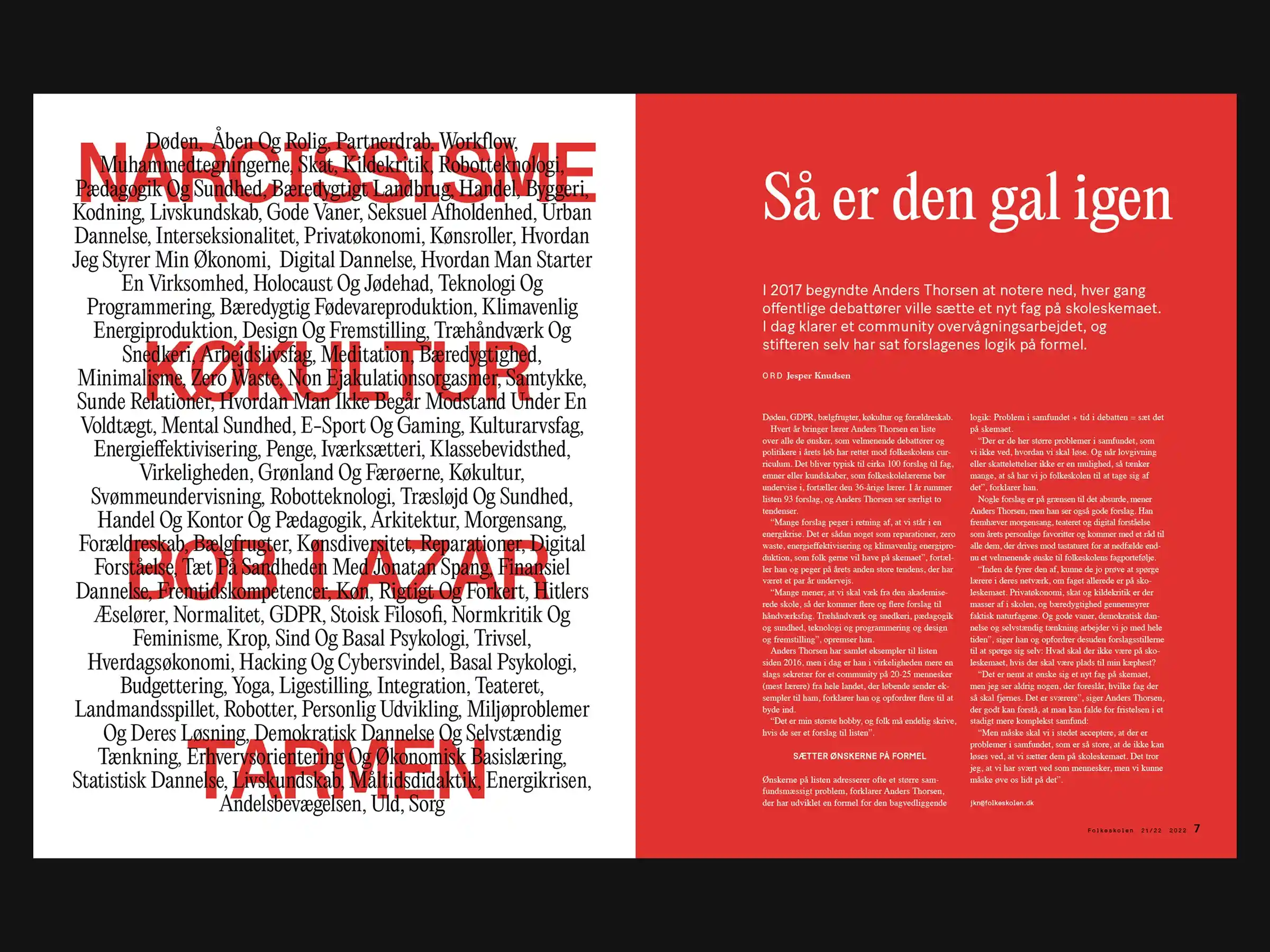
SPREAD.indd
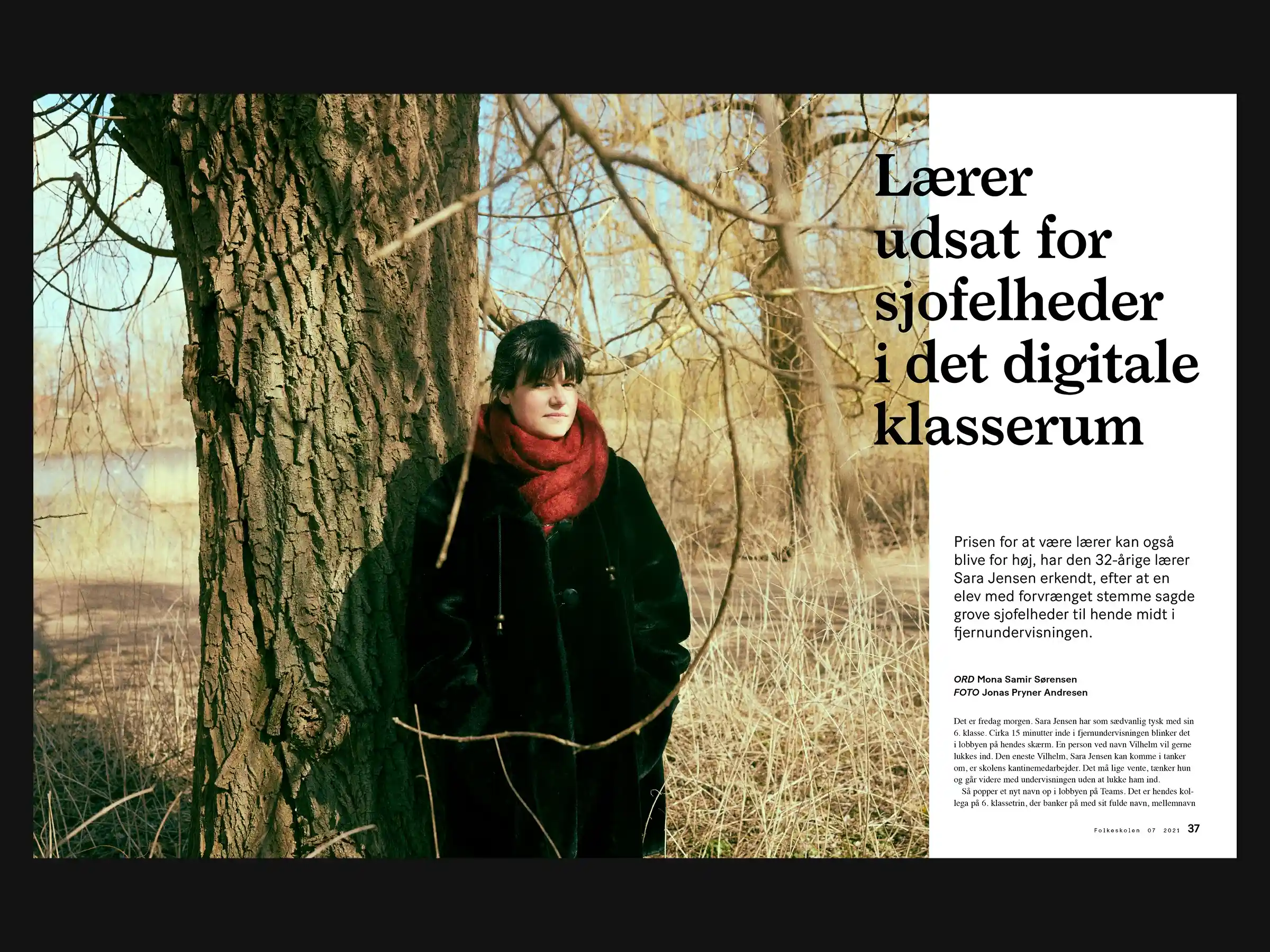
SPREAD.indd
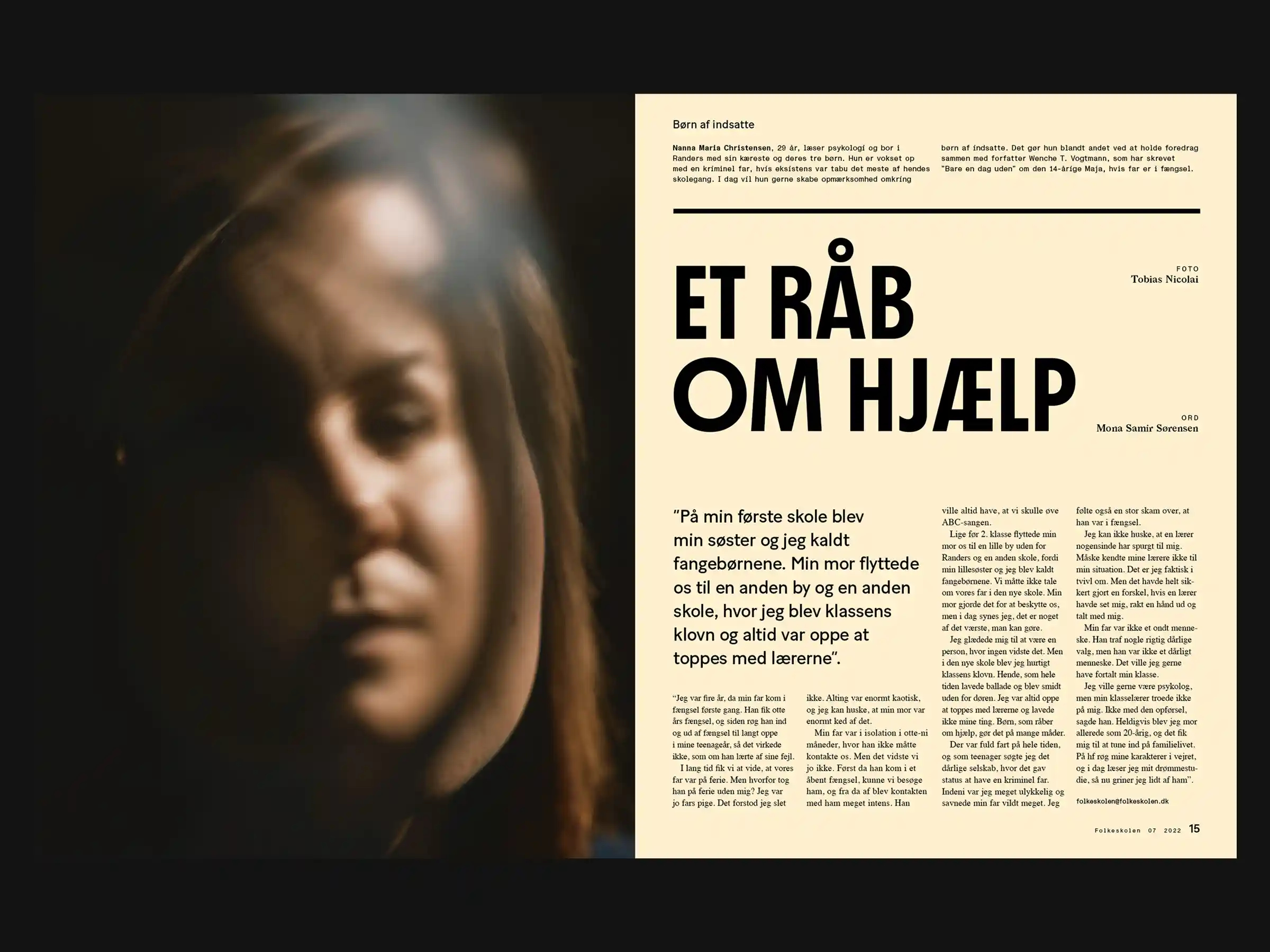
SPREAD.indd
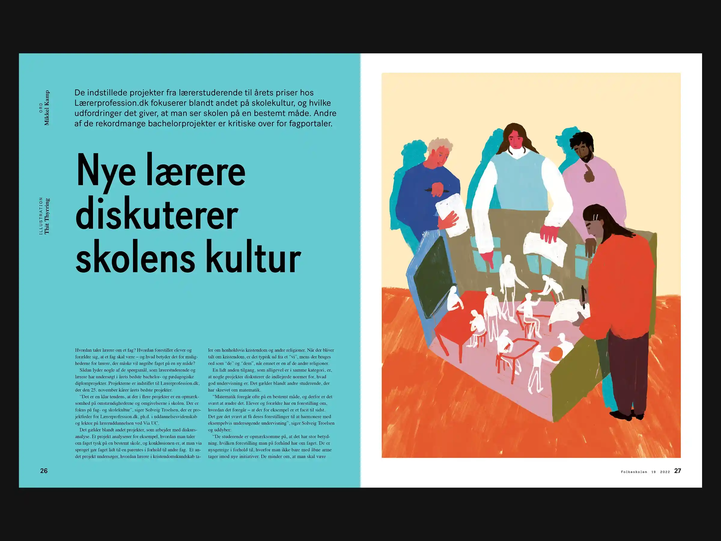
SPREAD.indd
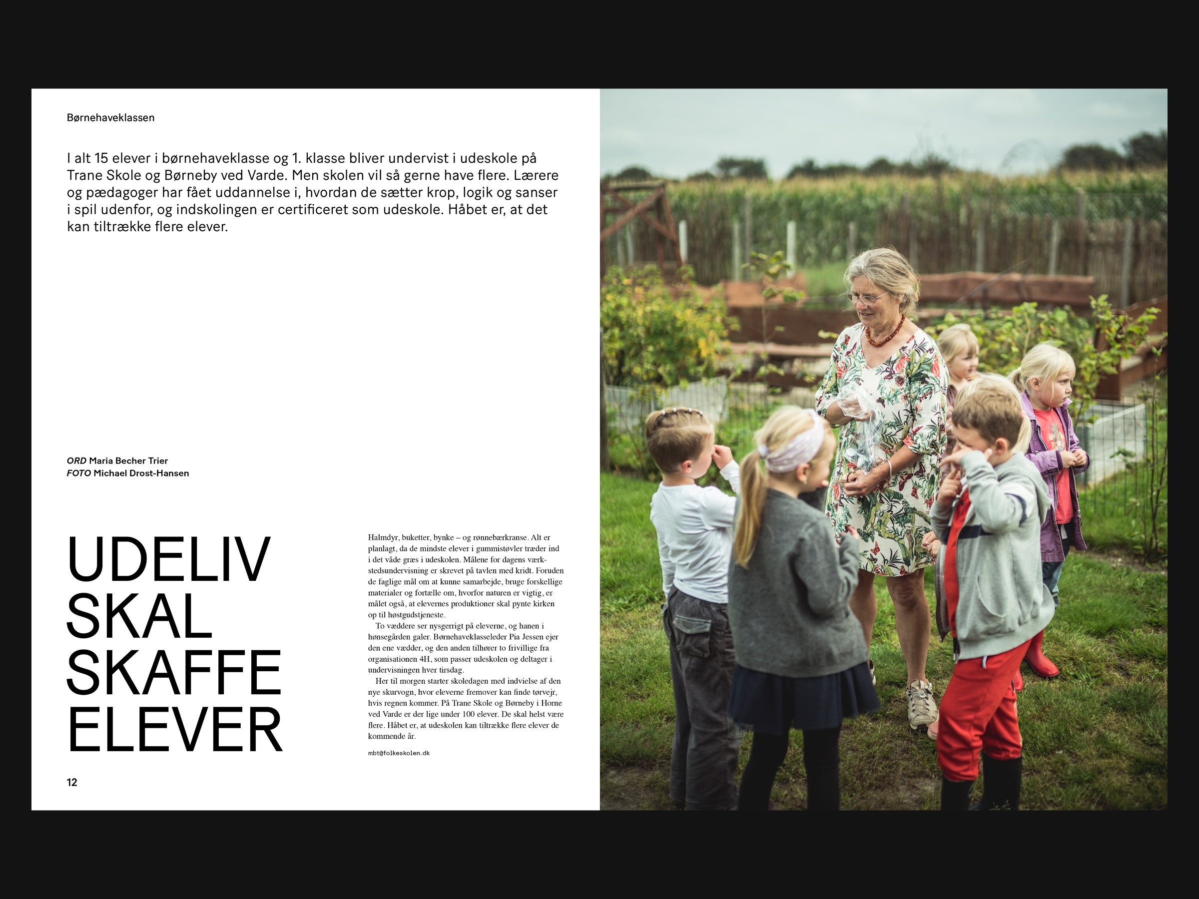
SPREAD.indd
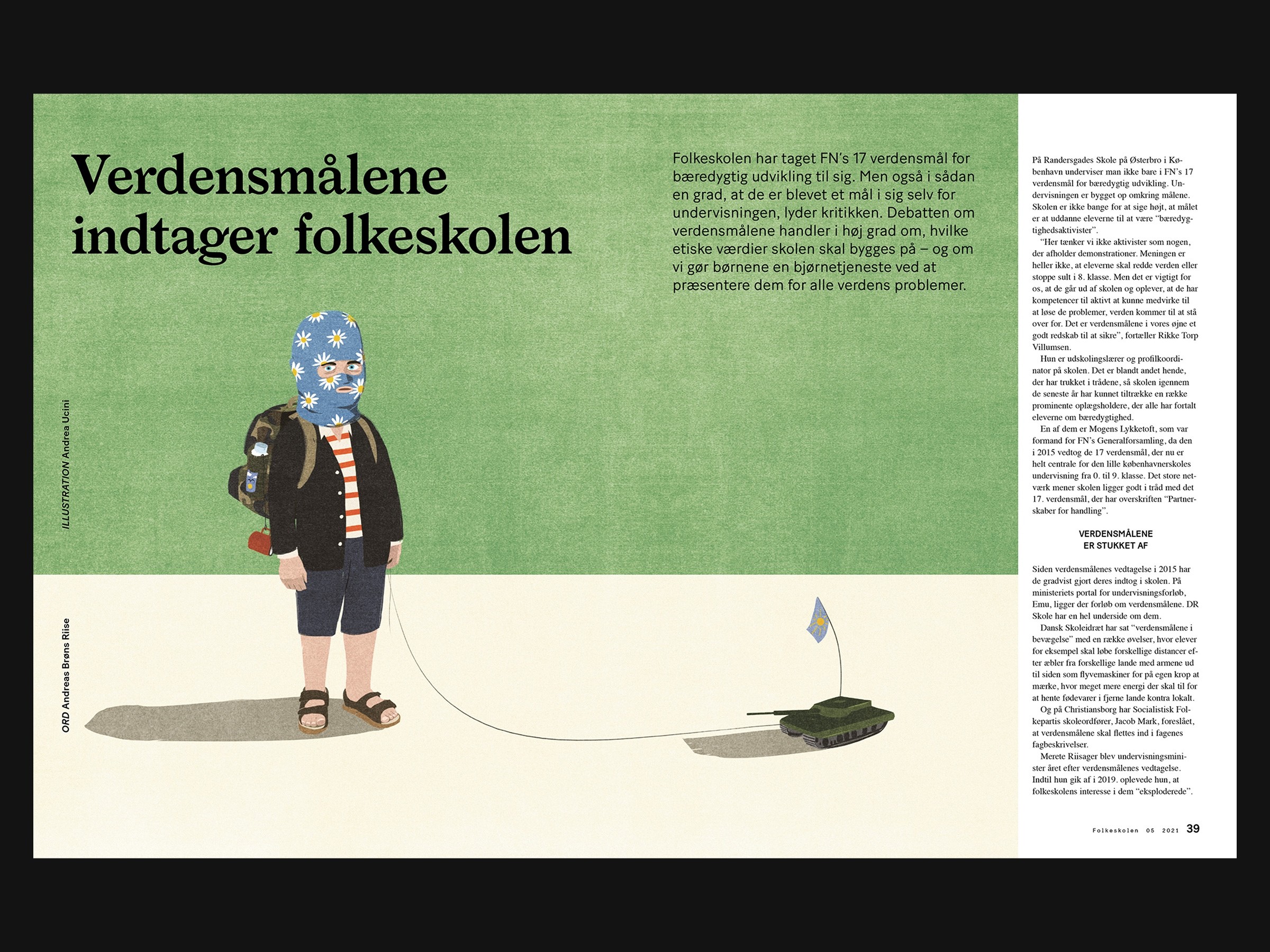
SPREAD.indd
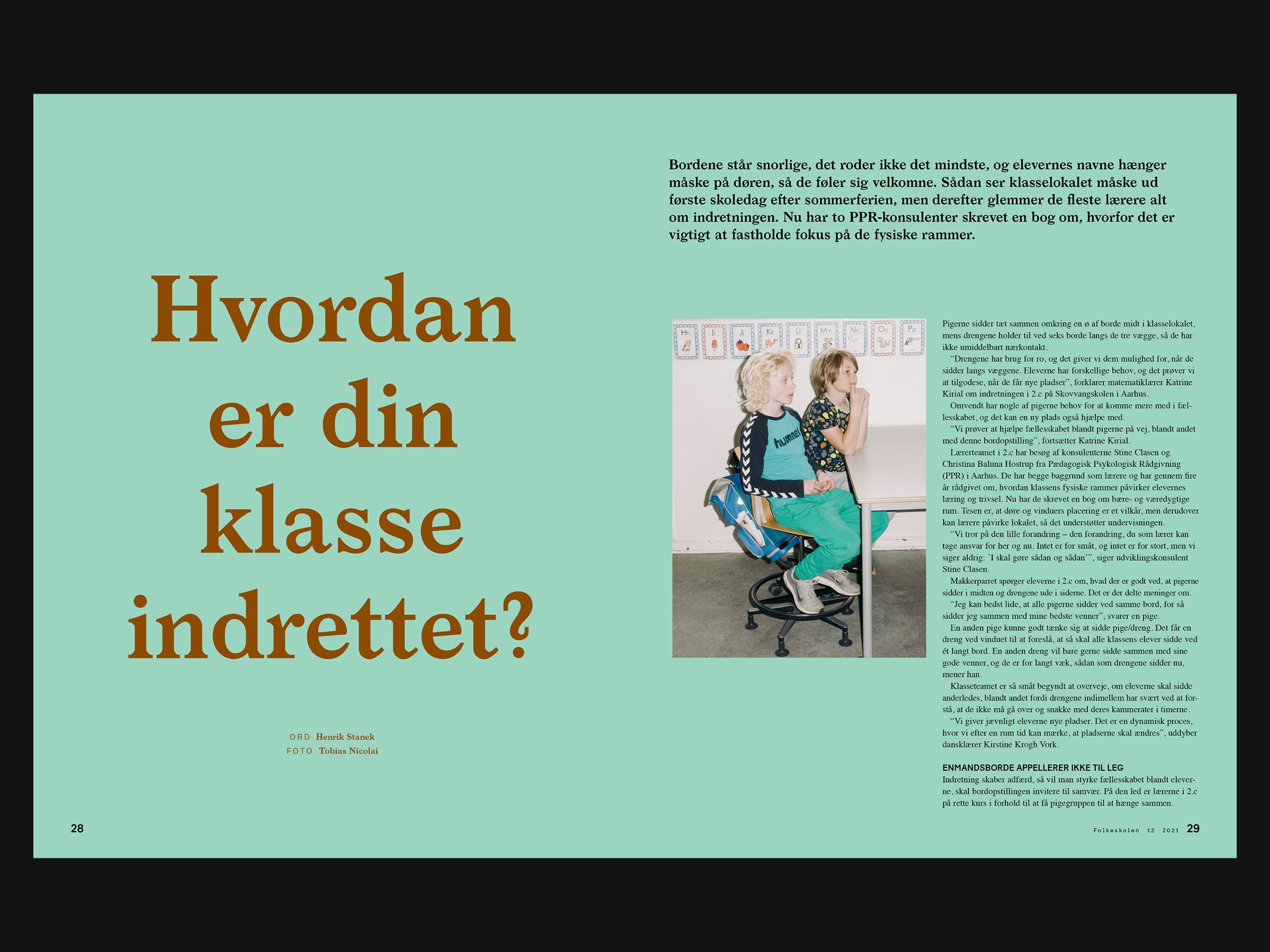
SPREAD.indd
FOLKESKOLEN
Identity, Production
,
2020 - 2023
We redesigned Fagbladet Folkeskolen's visual identity in 2020 and ran the editorial layout for four years. The real test of any identity system is whether it holds at scale across 2,000 pages, rotating photographers, and illustrators brought in from across the world. It did.
SPREAD.indd
SPREAD.indd
SPREAD.indd
SPREAD.indd
SPREAD.indd
SPREAD.indd
SPREAD.indd